

Color isn’t just decoration — in product photography, it’s strategy. The right color palette can trigger emotion, influence perception, and directly impact purchase decisions.
In this article, we’ll explore how to choose a color palette that aligns with your brand identity, engages your target audience, and increases visual effectiveness across platforms.
1. The psychology of color — how the brain reacts
Each color activates different emotional and cognitive responses in the viewer’s mind. That’s why your product’s colors — including background and props — silently shape the buyer’s decision.
| Color | Emotion it evokes | Best for |
|---|---|---|
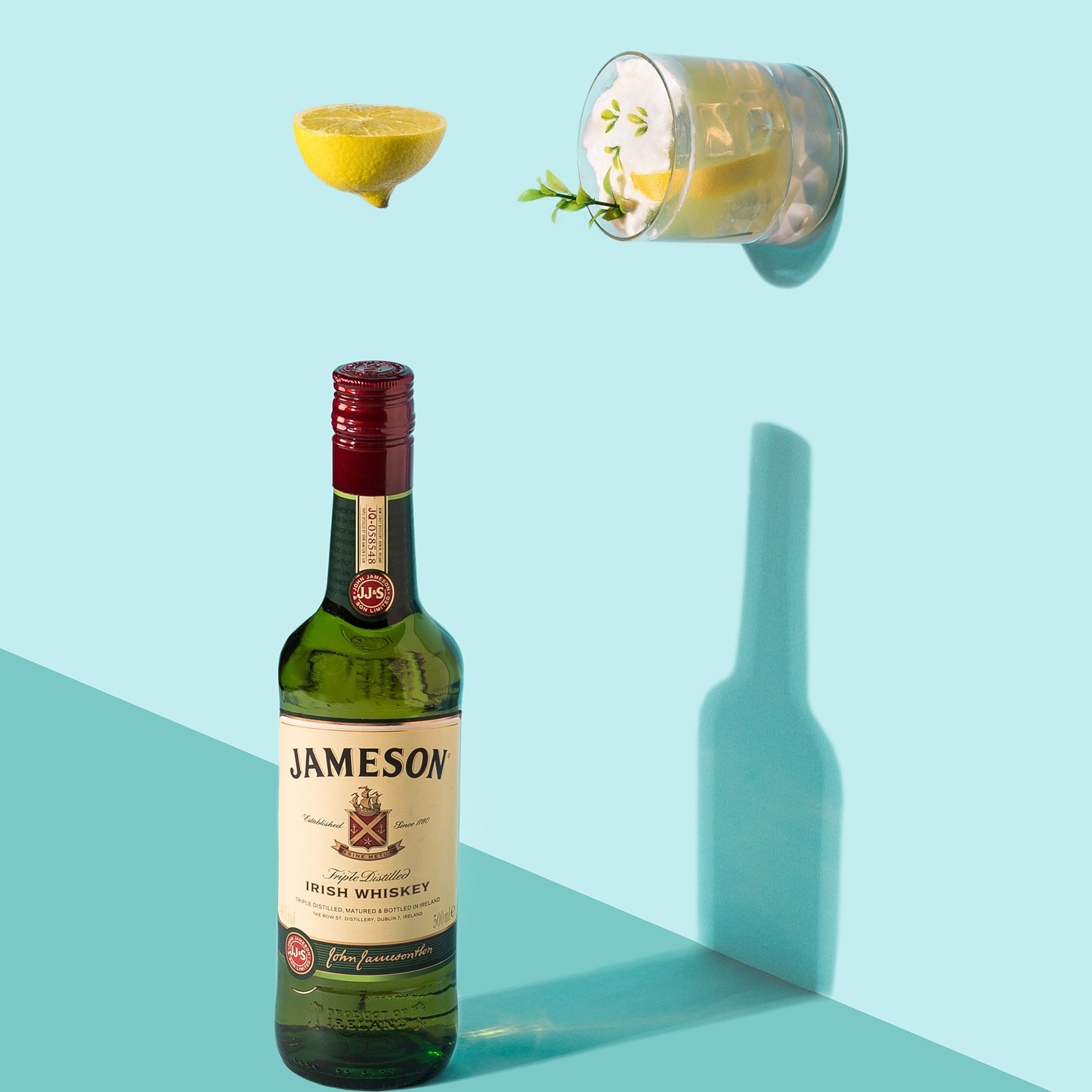
| Blue | Trust, calm, stability | Tech, electronics |
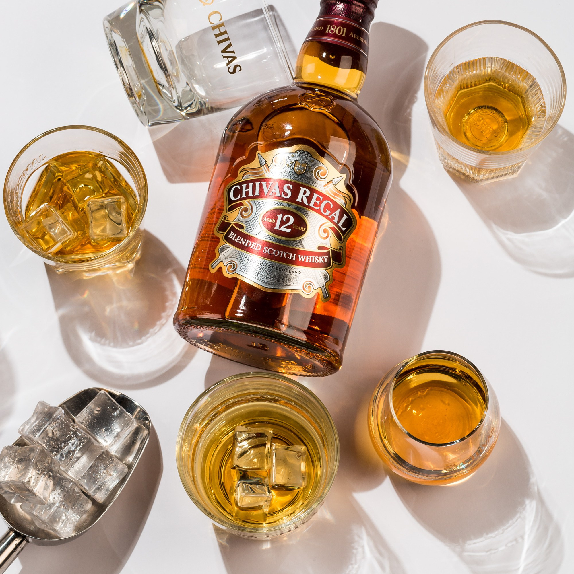
| Red | Urgency, passion, energy | Discounts, accessories |
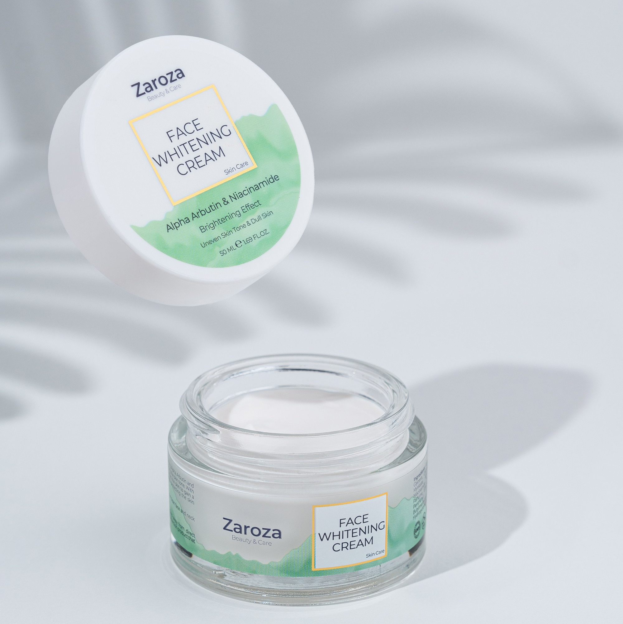
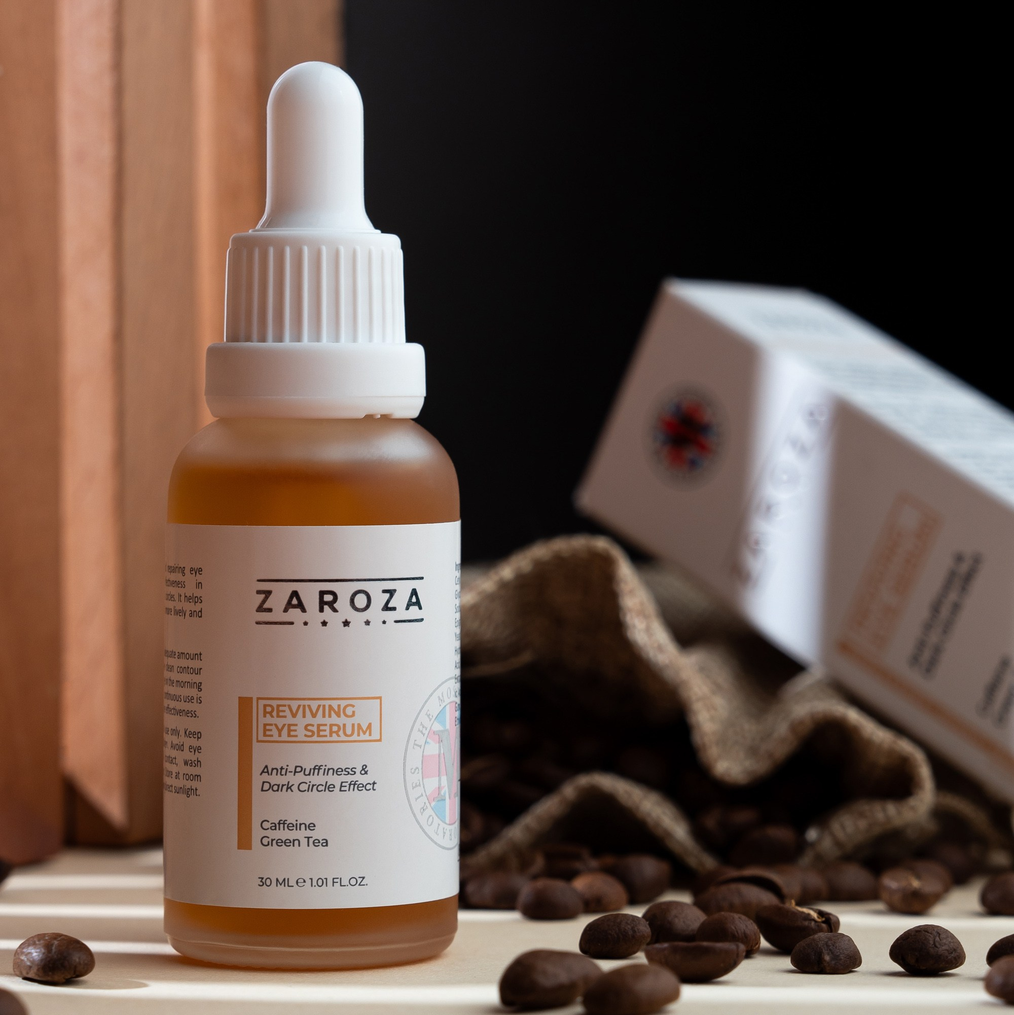
| Green | Natural, healthy, calm | Organic, skincare, eco goods |
| Yellow | Joy, attention, optimism | Kids' products, impulse buys |
| Purple | Luxury, elegance, beauty | Perfume, jewelry |
| Black | Power, premium, elite | Fashion, high-end goods |
| White | Clean, pure, minimal | Medical, tech, appliances |
2. Align with your brand identity
Colors are part of your brand’s visual voice. Using tones that clash with your brand’s palette weakens your visual consistency and audience connection.
Examples:
- Pastel/nude brands → use beige, blush pink, soft gray backgrounds
- Energetic/fitness brands → go bold with red, yellow, or electric blue
- Luxury brands → use deep purple, gold accents, black or charcoal
Tip: Always refer to your brand’s style guide before choosing colors for a shoot.
3. Color strategy by platform
Where you share the product photo matters as much as what’s in it.
Different platforms respond to different tones and styles:
| Platform | Recommended Color Approach |
|---|---|
| Bright, bold, saturated colors that pop in the feed | |
| Amazon / Trendyol / Umico | True-to-life, neutral colors with clean backgrounds |
| Soft pastels and harmonious tones perform best | |
| Facebook Ads | High-contrast colors (red, blue, yellow) drive action |
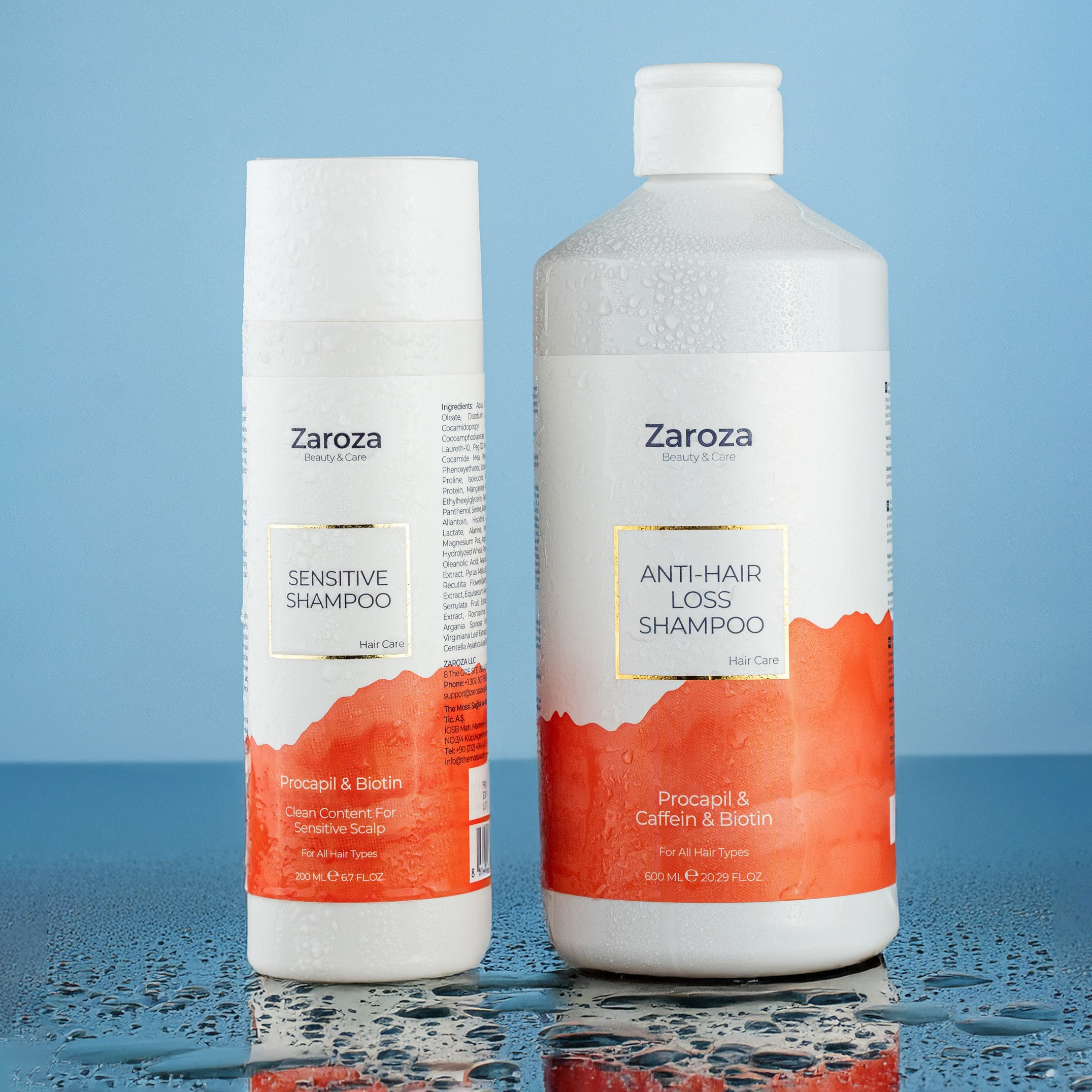
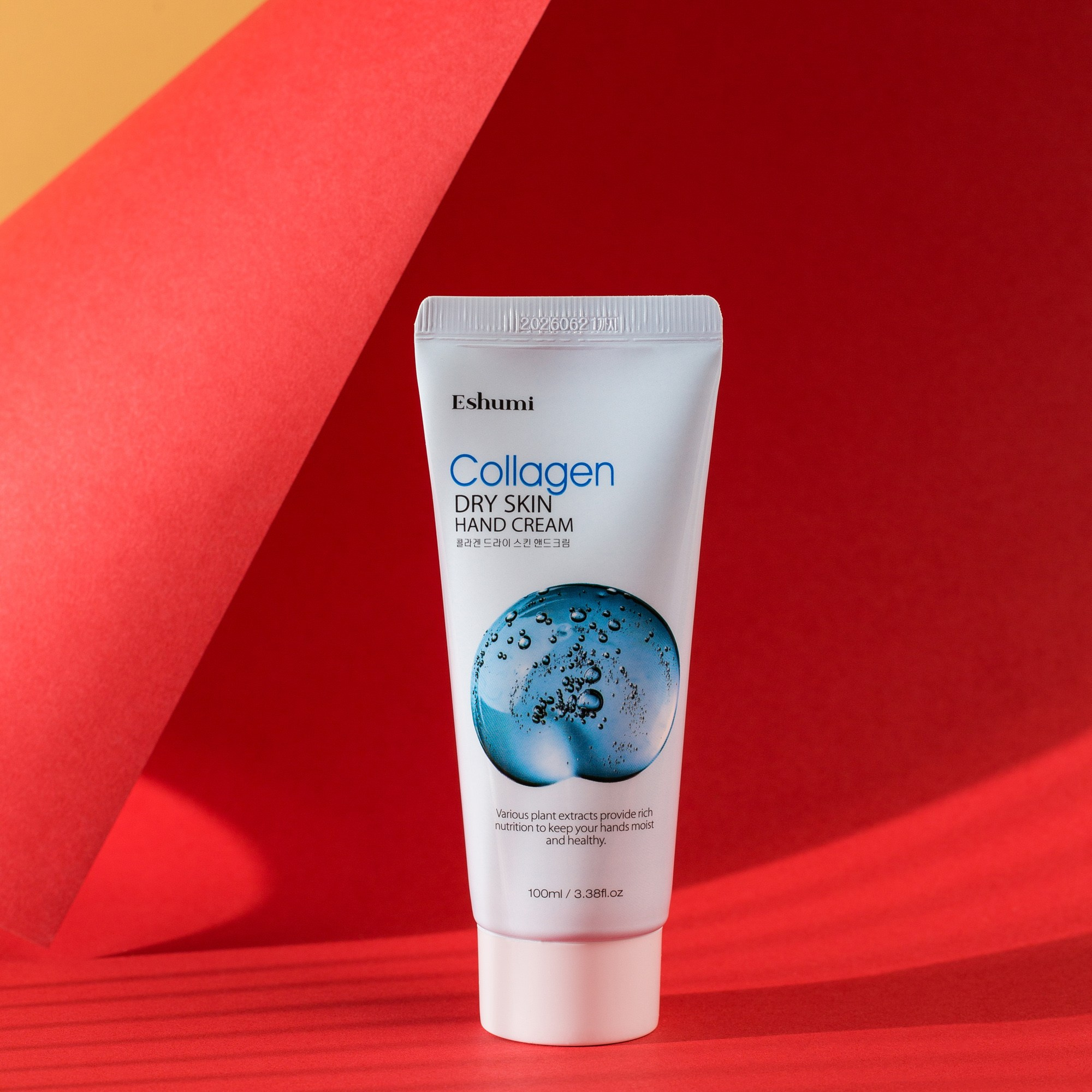
4. Contrast between product and background
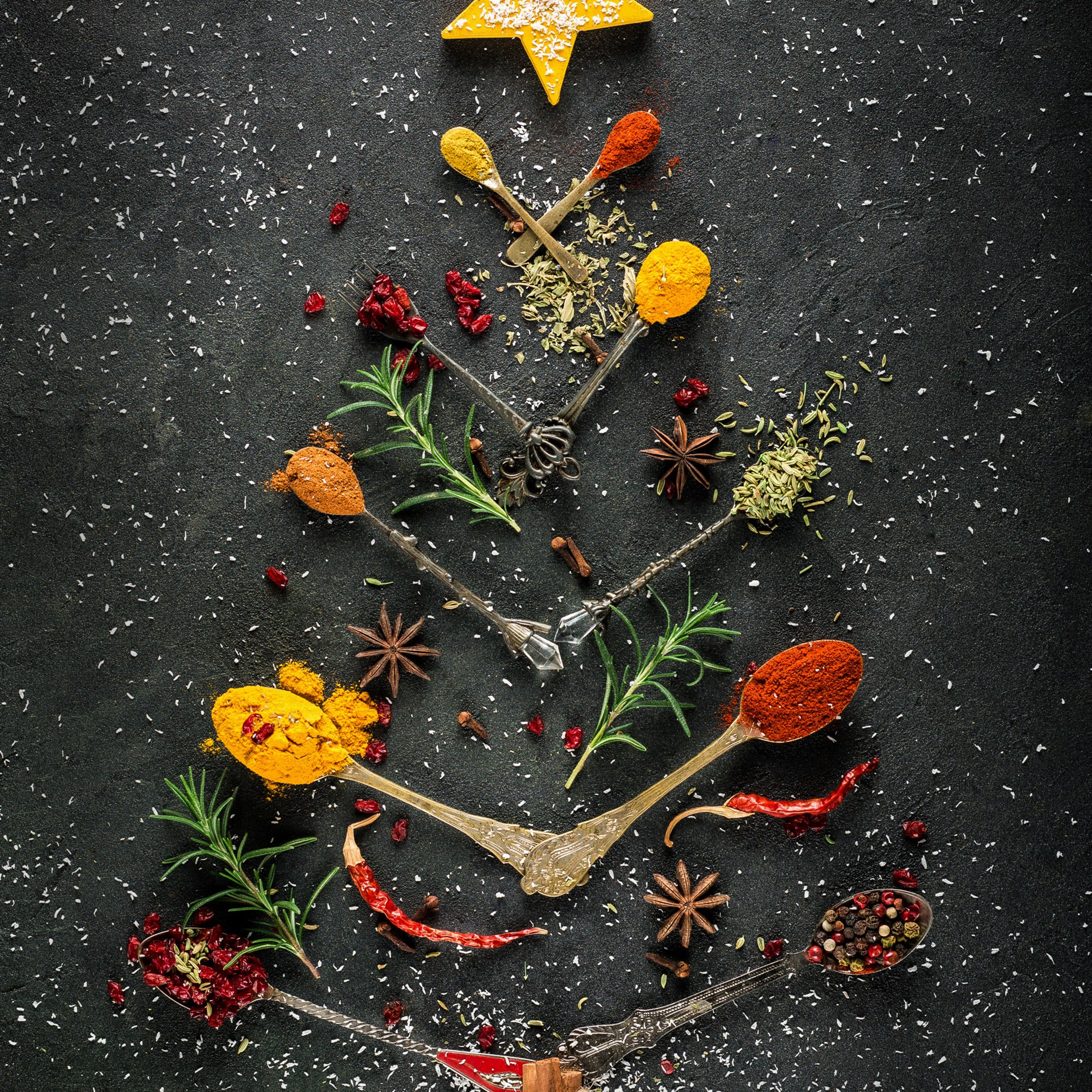
To draw attention to your product, always ensure it visually stands out from the background.
- Light product = darker background
- Dark product = lighter background
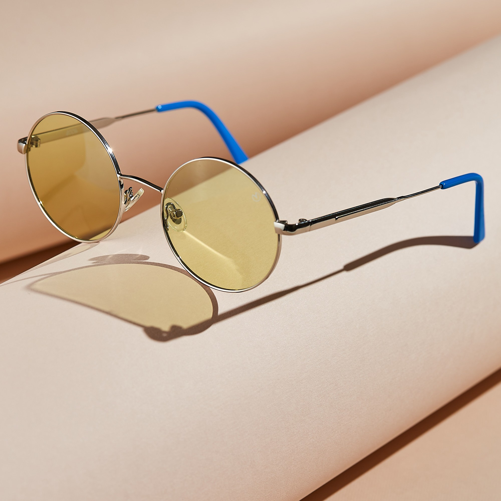
Example: Instead of photographing a white perfume bottle on a white background, try beige or light gray for better contrast.
5. Tools to help build your palette
Here are a few free tools to help you create color palettes that match your product and brand:
These platforms help you visualize tone combinations and ensure consistency across shoots.
Conclusion: Color doesn’t speak — it shouts.
Your color choices in product photography:
- Build emotional connection
- Trigger faster buying decisions
- Reinforce your brand’s visual identity
Final Advice:
For every shoot, choose a color palette that matches:
- The product’s tone and material
- Your brand’s voice
- The platform where it will be published
Great product photography is not just about lighting and focus — it’s about using color to create impact.
Blog

How Product Photography Influences Buying Psychology


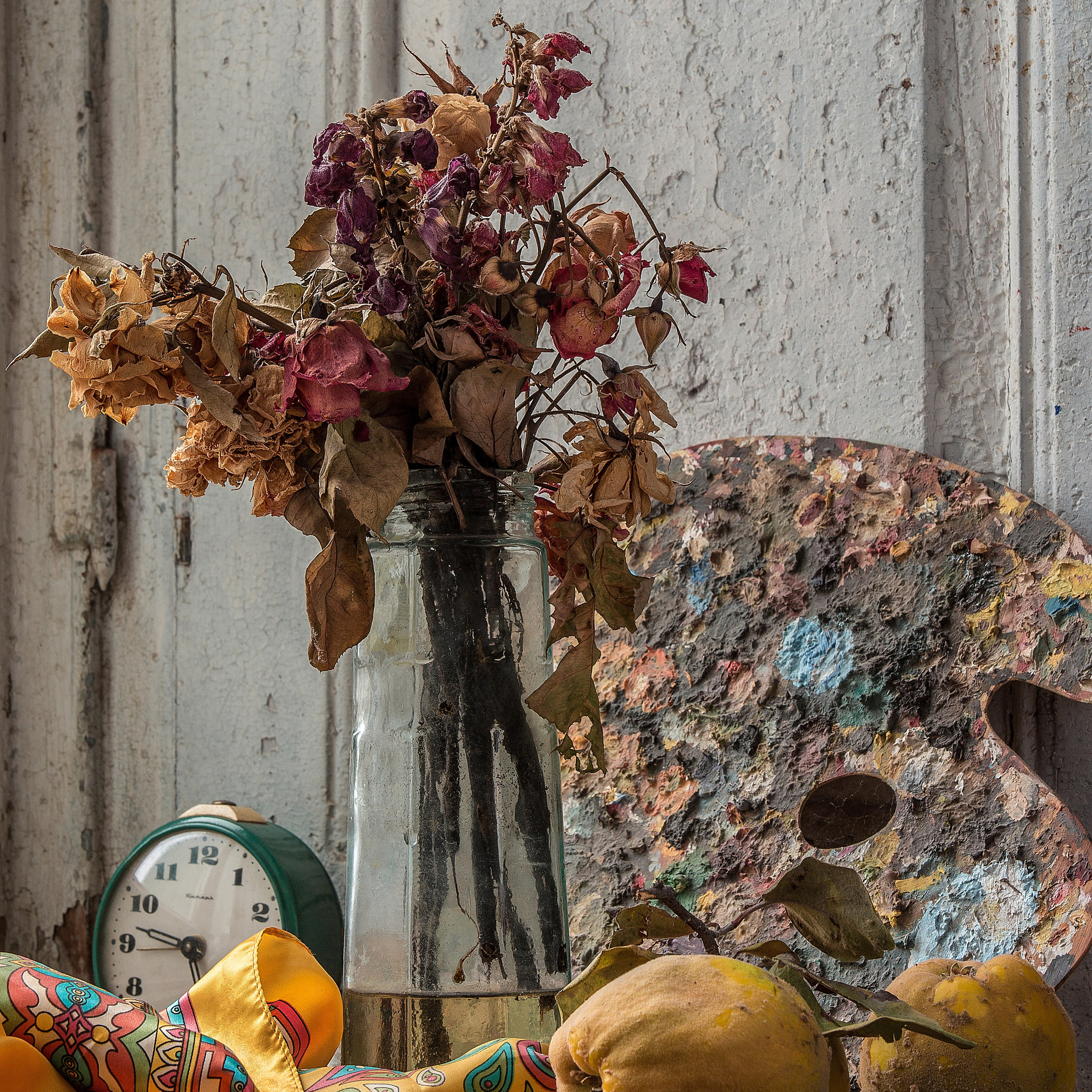
The History of the Still Life Genre
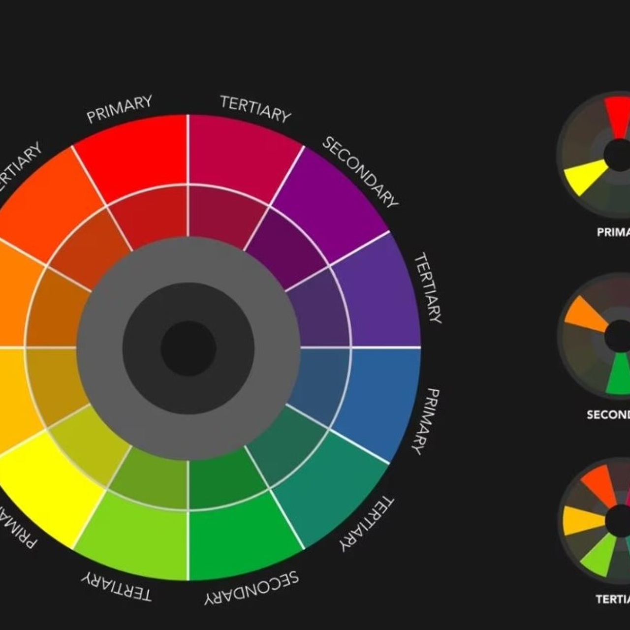
The Secret of Colors: What is the Itten Circle and Why is it Important in Photography?
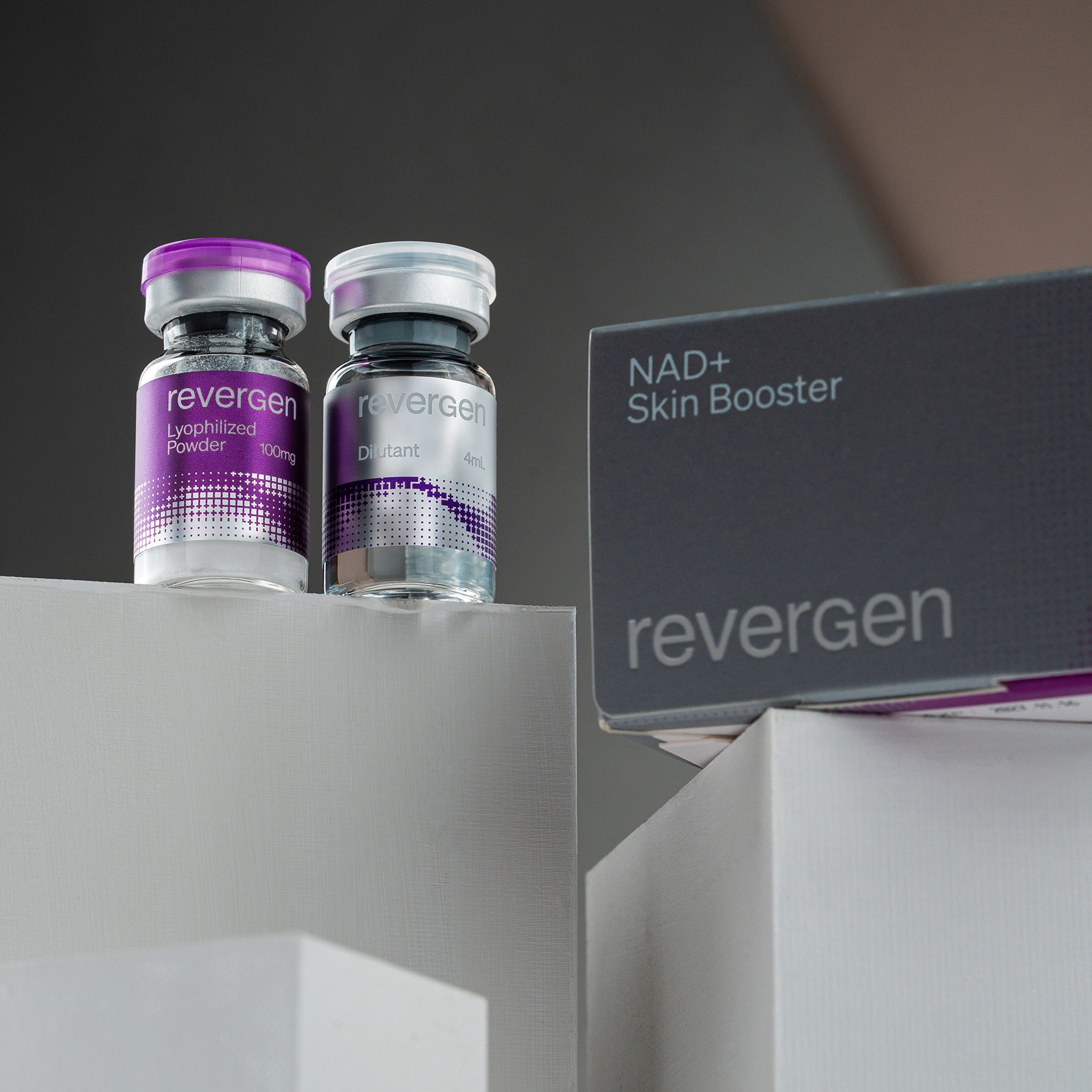
Mesotherapy Products Photography
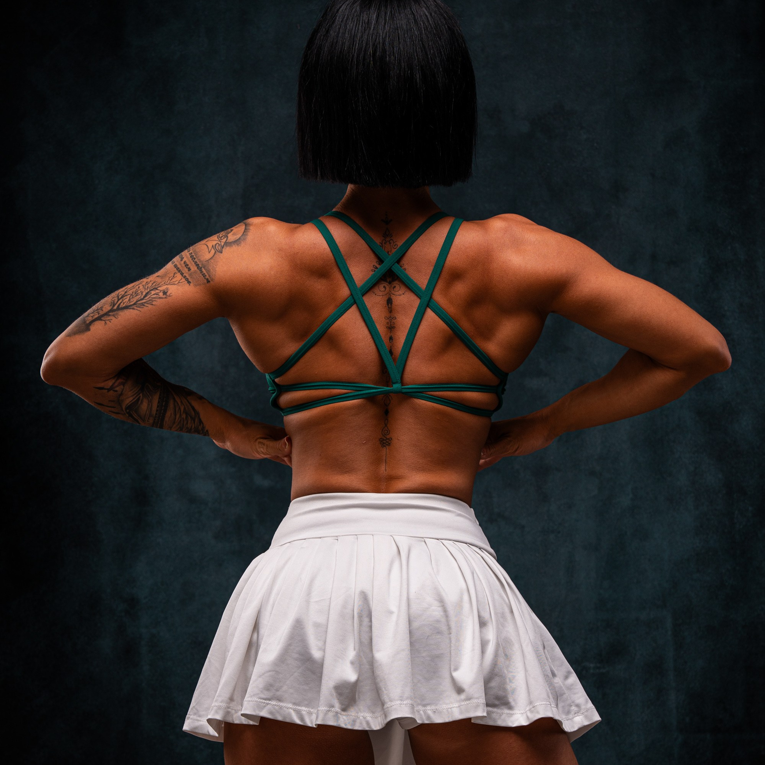
The Aesthetics of Power: Secrets to Professional Athlete Portrait Photography
Christmas & Winter-Themed Product Photography
Visual Anatomy — #7: Rusel Caviar (Premium Caviar Product Photography)
Art Reproduction Photography
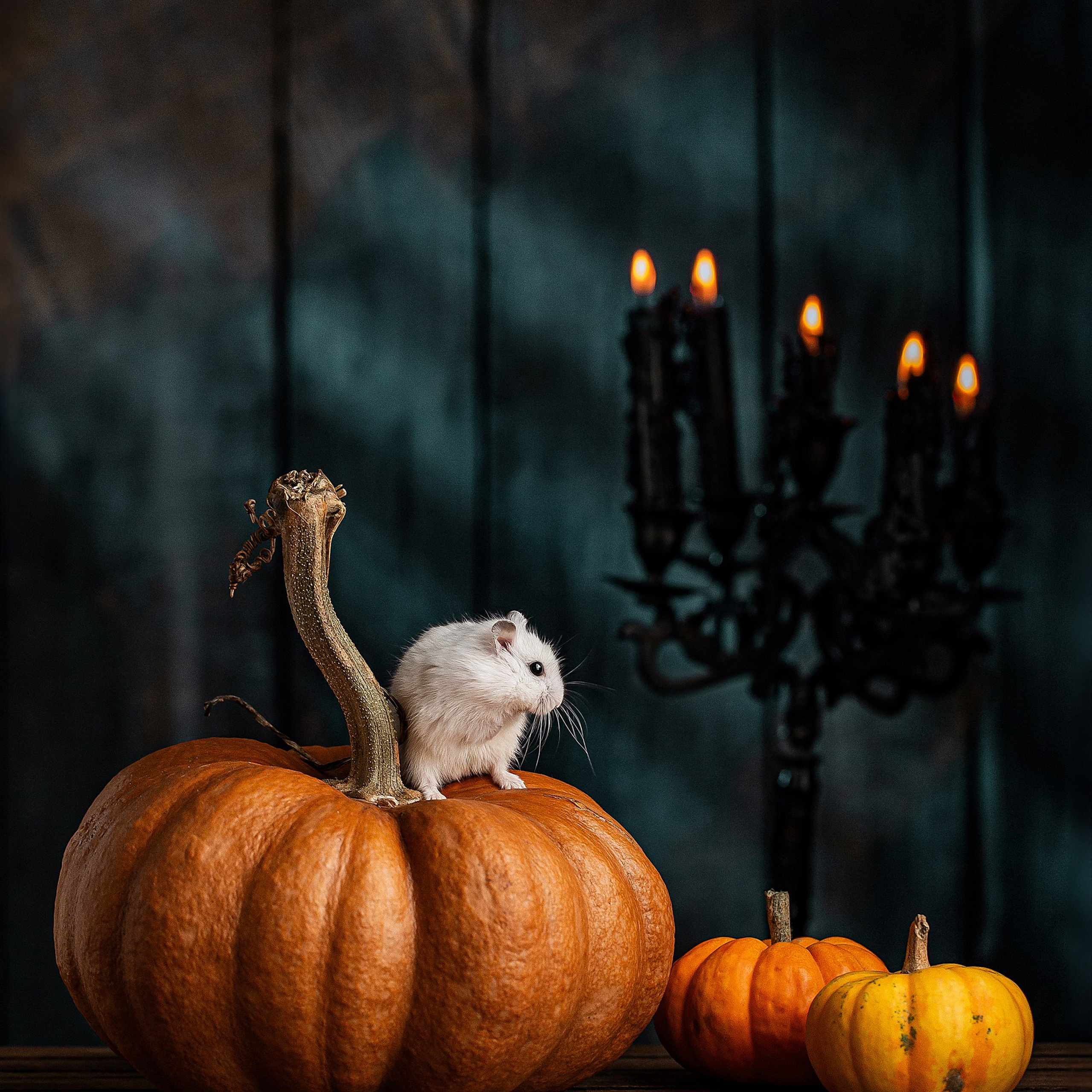
The Anatomy of the Visual — #6: Jungar Hamster and Pumpkins — A Living Still Life
