1. Composition — Order Within Controlled Chaos
At first glance, the number of lids may look chaotic — but this is a rhythmic repetition I intentionally created. The viewer’s eye is immediately guided to the main product placed on the elevated golden platform.
Using the lids as props was a deliberate decision:
- I increased brand visibility
- I created rhythm and visual movement
- I maintained purity in the frame without adding irrelevant objects
The golden platform elevates the product to a hero status, giving the image architectural structure. It delivers a clear message I wanted to convey:
“This product stands above the rest.”
2. Color & Material Harmony
One of the strongest features of this visual is the harmony between materials and colors. I built the entire scene around three premium tones:
- Gold
- Black
- White
Together, they communicate luxury, heritage, exclusivity.
Matte black absorbs light, while the gold elements reflect it — creating contrast and elegance.
I kept the background dark and neutral to ensure the gold highlights stand out clearly.
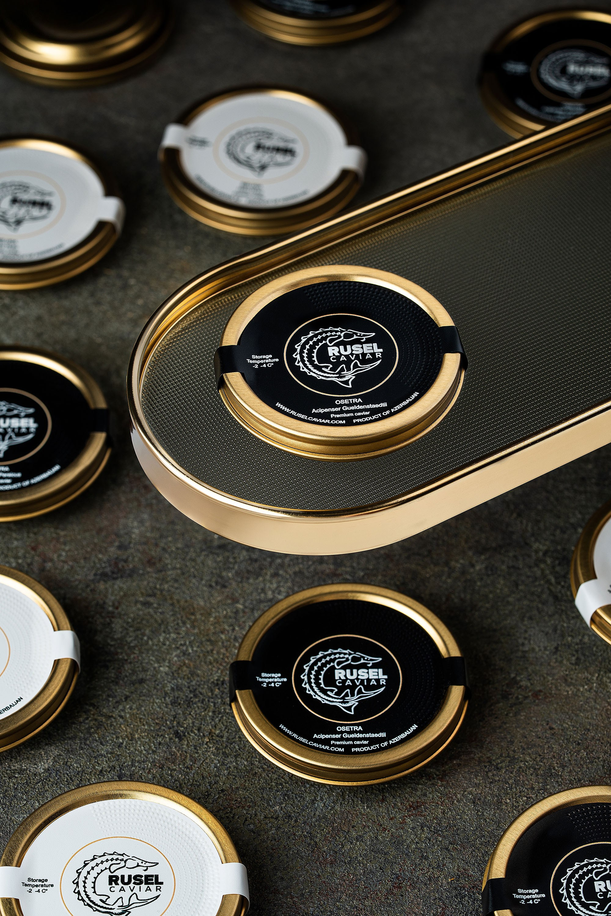
3. Lighting — Precision for a Premium Product
Metallic packaging needs precise lighting, and the lighting setup I built achieves three essential outcomes:
✔ Clean, defined highlights on the golden contours
Balanced, controlled, and without overexposure.
✔ Soft yet depth-giving shadows
This maintains a premium and realistic feel.
✔ Fully readable text and textures
Essential for a luxury brand where packaging details matter.
This lighting setup helps sell the value of the product through the image itself.
4. Prop Selection — The Golden Platform
One of my strongest creative choices here is the golden platform. Beyond fitting the brand’s aesthetic, it adds:
- Depth
- Height
- A focal point
- A sense of exclusivity
The harmony between the gold platform and the gold rim of the lids strengthens the luxury narrative.
5. Dynamic Yet Controlled Visual Flow
Despite the abundance of lids, the image does not feel chaotic because:
- Shapes repeat (circular rhythm)
- The color palette is controlled
- Lighting is balanced
- The hero product has a clear visual priority
This balance creates a frame that is both commercial and artistic.
6. Branding Strength
The image clearly communicates:
heritage · exclusivity · finesse · craftsmanship
The viewer immediately senses:
- The product is valuable
- The brand values detail and precision
- The experience it offers is elite and refined
This is exactly what premium product imagery must achieve.
7. Additional Thoughts / Future Shot Directions
This image is already strong, but for future sessions I may explore:
- Adding subtle side reflections to enhance the metallic feel
- Macro shots for textured close-ups
- A darker, moodier premium version for limited editions
Blog
Art Reproduction Photography

The Anatomy of the Visual — #6: Jungar Hamster and Pumpkins — A Living Still Life


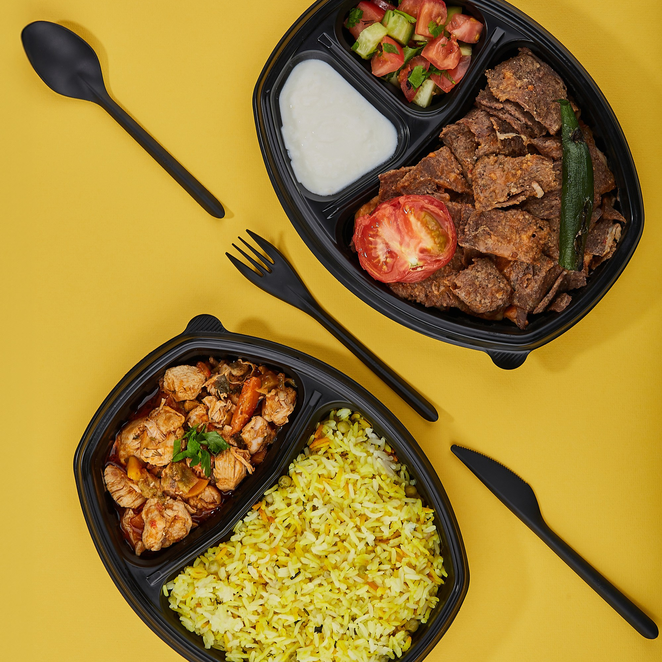
Disposable Food Packaging Photography

Eyewear Photography
Glass Product Photography
How to Take Stunning Photos of Books, Journals, and Publishing Products
7 Tips for Taking Amazing Product Photos
Macro Product Photography
Lifestyle Photography